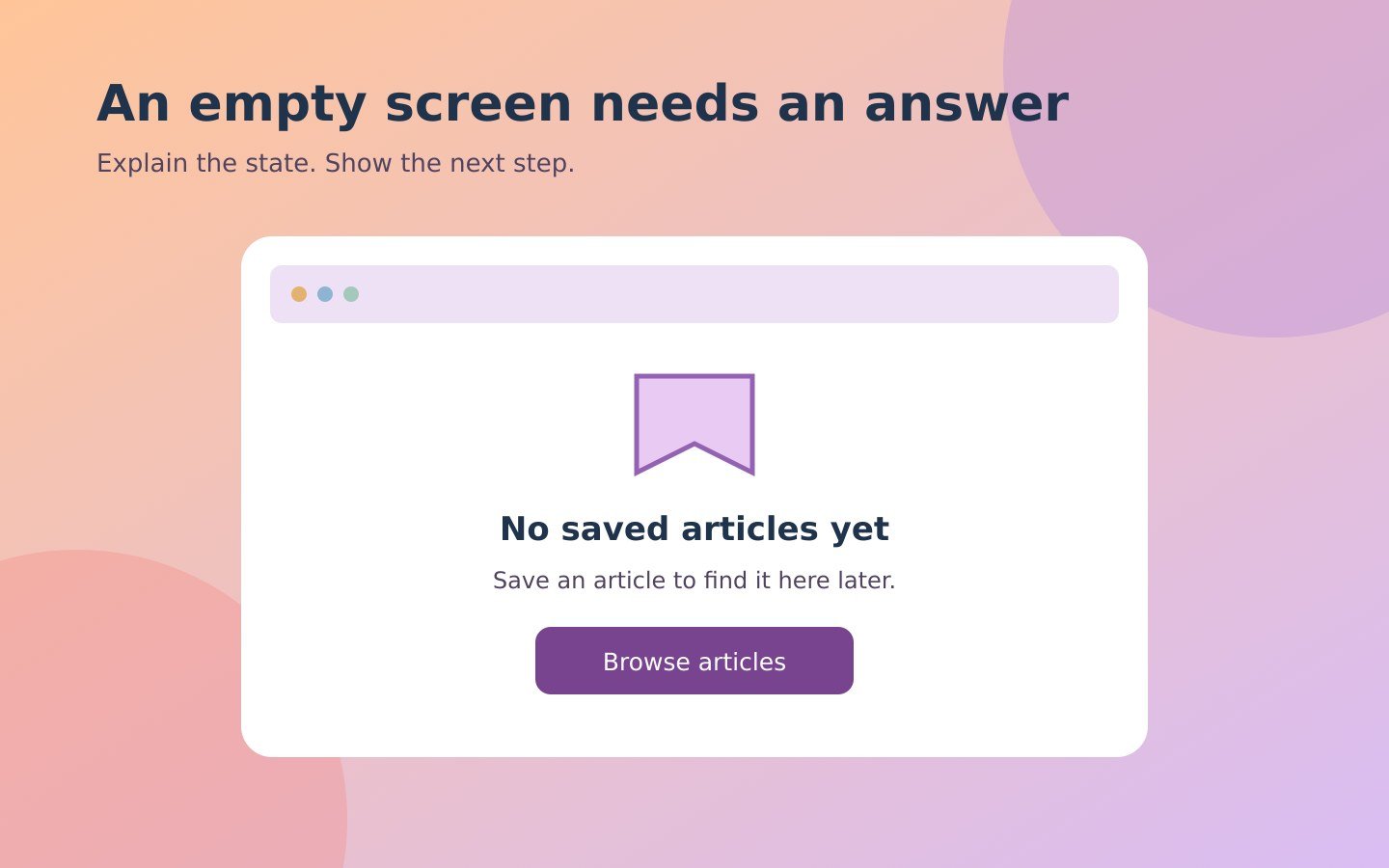
An empty screen still needs to communicate. A customer opens a saved-items page and sees nothing. A visitor filters an article library and gets a blank area. A new account has no uploaded documents. In each case, the absence of content raises a practical question: is this expected, has something failed, or is there something to do next?
An empty-state message answers that question where it appears. This guide focuses on writing the message and checking its relationship with the interface. The examples are hypothetical suggestions, not descriptions of functionality already available on this website or promises about a customer's account.
Identify the state before writing the message
Several situations can produce an empty area. A person may be using a feature for the first time. A filter may exclude all existing items. Content may still be loading. A permission restriction may hide records. A service may have failed to retrieve them. These situations require different explanations.
Ask the person responsible for the feature what the application actually knows. Can it distinguish a successful search with zero matches from a failed request? Does it know that an account has no documents, or only that documents could not be loaded? Copy should reflect the available evidence rather than disguise an unknown state as a reassuring conclusion.
Nielsen Norman Group's guidance on empty-state design emphasises communicating status and offering appropriate paths into a task. It also warns about misleading empty messages that appear while content is still being processed. The practical implication for writers is straightforward: confirm the trigger, not just the wording.
Say what is empty in ordinary language
Begin with the object the reader recognises. “You have no saved articles yet” is more informative than “Nothing here” when the page contains saved reading items. “No articles match these filters” describes a different situation. The noun and the condition tell the reader how to interpret the screen.
Avoid technical explanations unless they help the audience take action. “Query returned zero entities” exposes implementation language without clarifying the task. “No appointments are available for this date” is more useful when the system has actually completed that search. Do not substitute friendly language for accuracy, however; availability and loading failure are not interchangeable.
Use wording consistent with navigation and controls. If the interface calls a section “Saved articles,” do not call the same objects favourites, bookmarks and reading cards within one message. Consistent terminology reduces the amount of interpretation the reader must do.
Add one relevant next action
An empty state often benefits from an action, but the action must fit the situation. A first-use document page may offer “Upload a document.” A search with no matches may offer “Clear filters.” A completed task list may need no action at all. Do not attach the same promotional button to every empty panel.
Choose a label that describes what happens next. “Browse articles” is clearer than “Let's go” if the button opens the article library. If the action starts an upload, do not label it “View documents.” Match the wording with the actual destination and verify that the control works in the published interface.
Keep secondary options subordinate. A first-use page can explain where future content will appear without presenting five competing buttons. If a user needs help before starting, a clearly labelled help link may be useful, but it should not replace the main task with a general contact form unnecessarily.
Distinguish first use from missing results
For a new feature, a short explanation can establish what belongs in the empty space. A hypothetical saved-reading page might say, “Save articles from the library to find them here later.” This helps the reader understand the relationship between an action elsewhere and the current screen.
For a filtered list, describe the conditions instead. “No articles match the selected topic and date range” allows the reader to reconsider those choices. Where the interface makes it possible, preserve the selected filters so people can see what produced the result. Do not claim that the entire library is empty because a particular query returned nothing.
For a completed list, acknowledge only what the system can establish. “No tasks are due today” is narrower than “Everything is finished.” The latter may be false when future work exists. A small wording difference can change the meaning of the status substantially.
Handle failures without blaming the reader
When content cannot be retrieved, say that clearly. “We could not load your documents” communicates uncertainty more honestly than “You have no documents.” Add a recovery action only if it is supported. A retry button that repeatedly performs the same failing request without useful feedback is not a complete solution.
Do not write an instruction that risks losing work without understanding the consequences. “Refresh the page” may be harmless on a reading list but disruptive if someone has unsaved form entries. Ask the implementation owner what information is preserved and what a safe recovery step looks like.
A form validation error also needs more than an empty-panel message. The GOV.UK error-summary guidance pairs a page-level summary with messages beside the affected answers. That is guidance for form errors, not a requirement to show an error banner on every empty list. Keep different patterns separate.
Use warmth carefully
A light tone can suit an informal product, but it should not get in the way of the explanation. “No saved recipes yet” works without a joke. Humour about lost files, failed payments or missing records may feel dismissive when someone is already concerned. Let the seriousness of the task guide the tone.
Avoid exaggerated praise for actions the user has not taken. An empty project dashboard does not establish that someone is organised, successful or ready to launch. Similarly, “All safe” may imply a security assessment that an empty notification list cannot support. Prefer specific observations over broad reassurance.
If the brand uses playful language, keep the core information literal. A decorative illustration or a brief supporting phrase can carry personality while the heading explains the actual state. The message should remain understandable when the illustration is unavailable.
Review content and design together
Check the message on the actual screen. A concise heading may become unclear when separated from its section title. A help link may be difficult to distinguish from body text. A narrow screen may wrap a button label awkwardly or push the explanation far below the empty area.
Test the same state on a phone and a larger display. Confirm that the text remains readable, that the action is visible and that keyboard users can reach it. Do not place essential instructions only inside an image. Decorative artwork should support the message without becoming the only explanation of what happened.
Also test transitions. What appears while loading? What happens after a successful upload or a cleared filter? The empty-state copy must disappear or change when the underlying state changes. Good wording cannot repair an interface that continues showing the wrong condition.
Build a small message inventory
For each empty area, record the trigger, heading, explanation, primary action and destination. Add whether the message is for first use, zero results, completion, restricted access or a retrieval failure. This compact inventory helps editors spot cases where one sentence has been reused across incompatible states.
Review the inventory with someone who understands the feature. Use a test account or an approved demonstration environment when possible. Do not remove real customer data to manufacture an empty state. Capture the observed result and note any behaviour that remains unverified.
For related content, see website copywriting and the brand-voice guide. The final standard is practical: readers should understand why the area is empty and what, if anything, they can do next. An honest explanation is more useful than filling the space with decoration.